Curry Leaves Co is a food brand inspired by the rich flavors, traditions, and warmth of South Indian cuisine. The branding was designed to capture the essence of authentic Kerala cooking while presenting it through a modern and memorable visual identity that resonates with today's consumers.
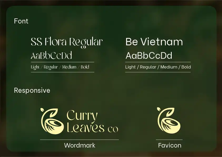
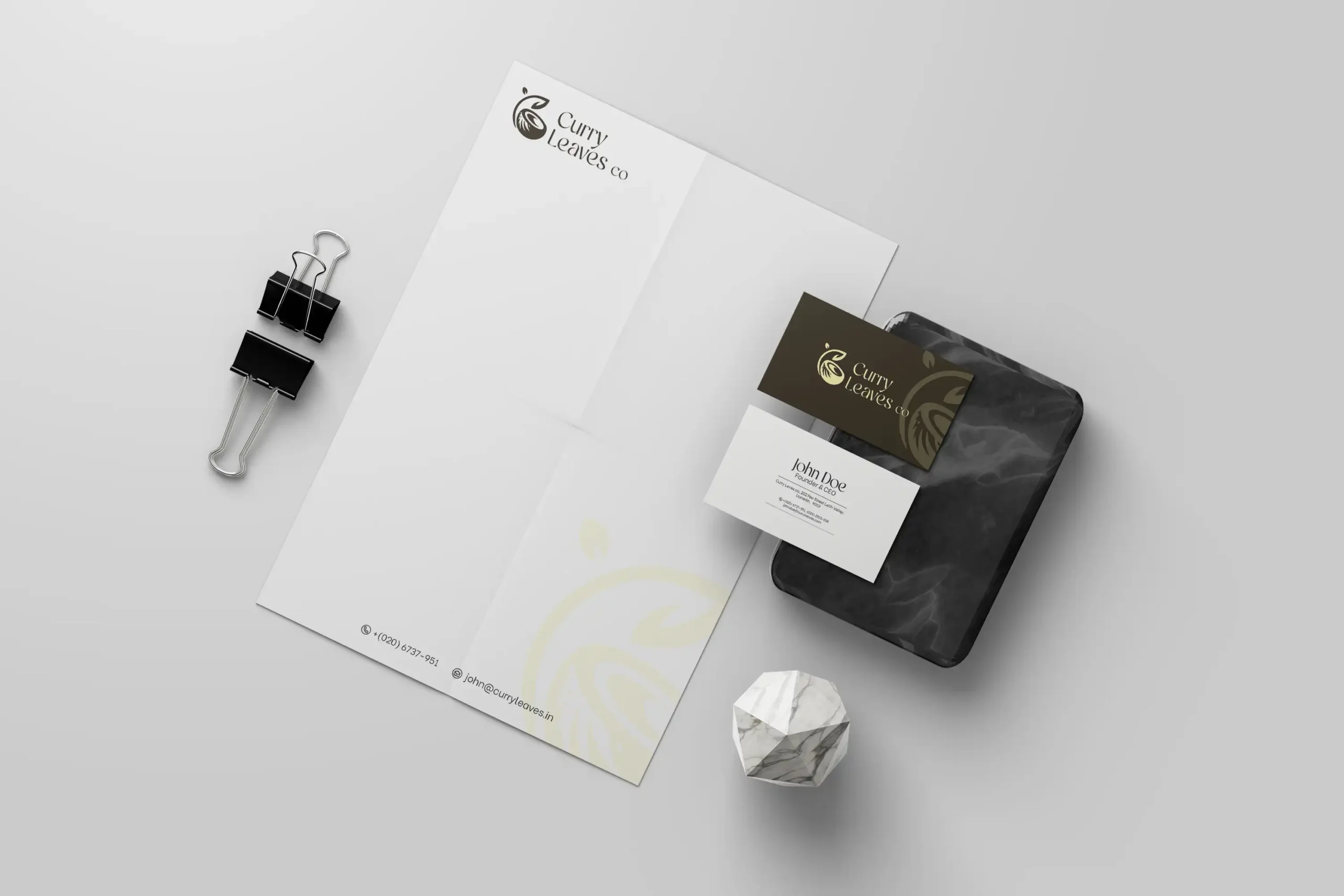
The objective was to create a distinctive brand identity for Curry Leaves Co that reflects its commitment to authentic South Indian flavors and cultural heritage. The brand needed a visual language that would instantly communicate freshness, tradition, and quality while remaining versatile across packaging, restaurant applications, digital platforms, and marketing materials.
One of the key challenges was creating a logo that represented the essence of Kerala cuisine without relying on generic food-related visuals. The identity needed to balance tradition and modernity, ensuring that it felt authentic to its roots while remaining relevant and appealing to a contemporary audience.
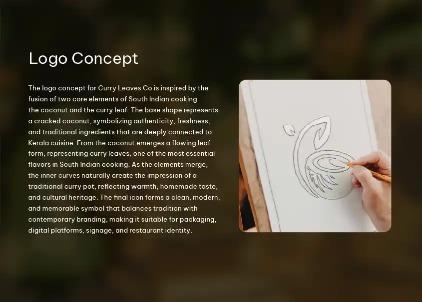
Our approach focused on translating the core ingredients and traditions of Kerala cuisine into a symbolic visual identity. The logo was developed by combining two iconic elements deeply associated with South Indian cooking the coconut and the curry leaf.The base form draws inspiration from a cracked coconut, representing freshness, authenticity, and the natural ingredients that form the foundation of Kerala cuisine. Emerging from this shape is a flowing curry leaf, symbolizing one of the most recognizable flavors in South Indian cooking. As these elements merge, the inner curves subtly create the silhouette of a traditional curry pot, evoking feelings of warmth, homemade food, and cultural heritage.

We're here to answer any question you may have.